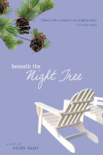
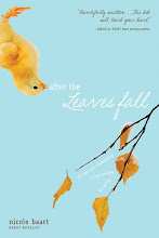
Anyway, my current site (though absolutely lovely) is rather tied to my book The Moment Between. Which would be great if TMB was a bestseller on the New York Times list. Since it's not, I need my site to be more about my books (and my vision) as a whole.
A while back I asked my readers (you!): Who are you? And I wasn't surprised at all by the answers. In my estimation (and according to your answers) we are a group of intelligent, often educated women who are strong and independent but who embrace our femininity. We're students and professionals, mothers and grandmothers. We accept the reality of a broken world, but we are not jaded. We love beauty, and although we accept that life is messy, we refuse to stop wearing white. I think this description encompasses my books as well, and highlights what I attempt to do with each of my novels--show one small way that the light shines brighter because of the darkness around it.
Why am I telling you all this? Because I need your help. My good friends (Brand New Graphics and Ellenvelde) are working on the website redesign, and part of the process was taking some photos that visually capture the essence of my books (and me, I suppose). We're looking for something that balances harsh with feminine, hope with grit. A marriage between idealism and reality. We had a whirlwind photo shoot that took place in a soybean field, in the shadow of grain elevators, and even on a car compacter. My question is this: Which background/pose/facial expression/attire/etc. best represents our vision? Bear in mind that for every setting represented below, we have close-ups, shots where I'm smiling, pensive, or not looking at the camera at all. I'd love to hear what you have to say.
Photo 1
Photo 2
Photo 3
Photo 4
Photo 5


My hubby likes photo 1, I like photo 4...photo 3 makes me fearful for your life. :)
ReplyDeleteNicole,
ReplyDeleteI prefer photos 1, 2, and 4. You look great in all of the photos! Here is my critique of each photograph. I don't really care for photo 3, although it is unusual and may catch a reader attention; it seems less intimate (less of a connection between you and your readers). Number 5 looks like a senior photo shot to me (I mean no offense to you or the photographer), which may be all right if you’re wanting to connect directly to that age group…). Now out of 1, 2, and 4… hmm. Photo 4 is a nice shot, it has good lines that direct back to the main focus (you), but I don’t really get the feeling of “hope within the rough world” from it. Photo 2 also has good lines, with the stalks of wheat pointing up to your face. It does give a soft yet, tough girl kinda feel to it; however, it reminds me of a cover of a romance novel (I realize this is not for a cover of a book, just that’s the feel I get from it.) Photo 1 is my first choice; the photo has a light air feel to it. The space and angle of the building directs the viewer to look at you, as well as your placement in front with the lighter color in the background behind you. The light airiness gives a feeling of softness and hope, yet the ground where you sit gives it a “down to earth” feeling. The industrial buildings in the background add to the “grit” (toughness) or independent woman kinda feel.
I hope I was helpful. :)
Tana Cox
Tana_Cx at yahoo dot com
I vote one or two or four. They all look great, but I think I like those the best, and if I had to pick one, I vote for number two.
ReplyDeleteI vote for 4 also. Something about it just reaches out and grabs my attention.
ReplyDeleteI vote for photo 1 or 4. There's something very reflective about both of them. I think, tough, that I prefer photo 1.
ReplyDeleteWell I LOVE photo 3! You're relaxed, close to the tracks (I wish the chair had been ON the tracks) and you're waiting for the train that is going to take you somewhere...to the top of the New York bestseller charts probably. It's the only one of the shots where the background doesn't box you in (so to speak). And it has the most provocative pose from you. I think this is a good thing. It would have been better if you were a bit closer to the camera and the tracks stretched off in the distance behind you. Much more scope for the imagination with this one (as the red-head from PEI would say).
ReplyDelete#4 is the next best shot. I like a dressed-up you in the rusted, real world. It speaks about your writing. But my money is on #3. And it looks like I'm the only one who's saying that.
Photo 4!!! Totally love that one - you look hopeful, and it's a great contrast with the background. Love it.
ReplyDeleteThey're all gorgeous, but I like #1 and #4 best. I can't articulate why, but I'm drawn to the artistry of them.
ReplyDeleteI think your description of who you/readers are and what your writing represents is just beautiful. Every writer should have such clarity!
They are all so beautiful but I'd pick #1...they are all so beautiful but what a beautiful Canvus God has given!
ReplyDeletePersonally, I love 1, 3, and 4.
ReplyDelete1 - The colours are beautiful, and I love how absolutely full of joy you look.
3 - I like unusual. But you do get a little lost in the background, so maybe not the best choice.
4 - I love the expression on your face in this one.
One and Five!
ReplyDeleteI prefer photo 5. Honestly, on photo 4 my first reaction is to your boots and the necklace. I like a picture that is more about you than what you are wearing. Photo 4 has an odd pose. Photo 5 looks more natural.
ReplyDeleteThanks so much for your comments and feedback! It really does help a lot. :)
ReplyDeletePhoto 4 gets my vote!
ReplyDeleteMy favorites are 2, 3, and 4. I'm really liking where this new look may be going. Can't wait to see your new site.
ReplyDelete